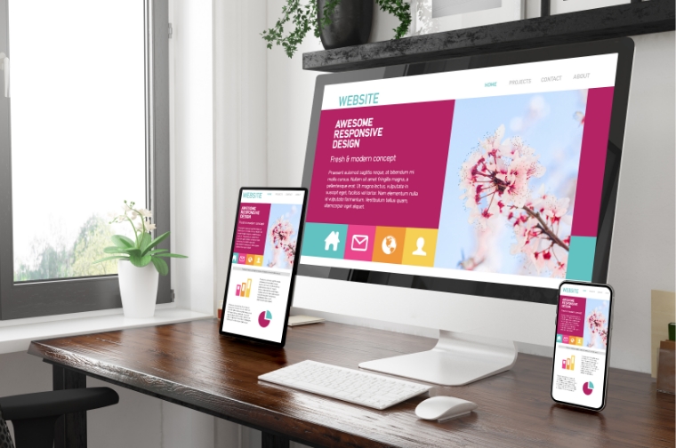
In today’s web arena, responsive web design has become one of the essential needs for every website. Responsiveness, strong functional features, impressive design, mobile-friendliness and fast speed are vital elements to win customers in the world of the web.
In 2015 when mobile users surpassed desktop users, businesses worldwide realised the need to have a responsive web design. Additionally, Google started rewarding and prioritizing websites that were responsive and mobile-friendly. Thus the arena of responsive websites began.
There are lots of advantages to developing a responsive website. A responsive website helps businesses to increase their reach to mobile users easily.
If you are a webmaster or a business owner and want to expand your business, beat the competition and increase the conversion rate, getting a responsive website from a Website development company should be your priority.
Know the top 10 benefits of responsive web designs for your business:
- More mobile trafficAs per SimilarWeb report, more than half of the traffic of US top websites came from mobile devices in 2015. So, businesses need to have websites that are compatible with smaller color screens as well. It helps you get access to a large number of user searching products and services through small screen size devices like smartphones and tablets. Professional website development company helps you get the best results in terms of a responsive web design, number of users and profits.
- Boost for SEO Why do you make an online presence? Obviously, to get more profit and customers for your products and services. Here SEO, along with a responsive website, works as the best solution for you. As said earlier, Google gives more priority to websites that are mobile-friendly and responsive. Therefore, responsive web design boosts your SEO and marketing campaign and offer better results on search engines.
- Consistency in design Indeed you can design and customize a traditional website and mobile website, but you will never bring the same look and feel for both. A responsive website is a perfect solution to keep your website with a modern look and mobile-friendly design.
- Easier analytics reporting Analyzing traffic reports is essential to make improvements. You should know how users interact with your website and where traffic is coming from. Managing a single responsive website helps you monitor the analytics. Google Analytics and other monitoring tools offer multiple reports on different data as per users’behaviour and content performance on the web and different devices.
- Low cost and quick mobile development Developing mobile apps is not very handy and budget-friendly for all businesses. Here responsive websites act as the best solution for businesses that need to have the mobile presence of their business. Since time is money, responsive web design is fruitful as it saves time and money. It is a less costly option than a mobile app. Even it is the best solution for small businesses and startups to create responsive websites for their business progress. You will get saving benefits in the special configuration costs, maintenance cost, development cost etc., with a responsive website that uses two different versions.
- Lower maintenance required Maintaining a website and app for the same content needs additional maintenance efforts and support from developers. Here responsive website design helps you get lower maintenance benefits. This is one of the most profitable benefits of having a responsive web design. Moreover, having two separate websites for desktop and mobile needs two different content strategies. Therefore to maintain both, you will need two separate teams. Hence responsive web design tends to lesser tasks for designers, developers and business owners.
- Faster web pages Mobile users need everything on their screen a second time. Lots of researches show that mobile users never visit web pages having a load time of more than 3 seconds. Therefore, if your website is not responsive, it will take a lot of time to navigate it on the mobile screen. Hire website developer having expertise in creating highly functional and easy to navigate responsive web page.
- Enhanced offline browsing experience Responsive web design enables business owners to provide dedicated and quality content to users across multiple devices. The offline browsing facilities of HTML5 tend that websites can be accessed’on the go effortlessly. Most of the time, users don’t like a lot of pinching, shrinking and zooming their screens at the
time of their first visit. In this situation, you will lose your users. - Enhanced online browsing experience Lots of business owners say that the first impression is the first step to get users’ attention. No matter how people choose to visit your website, you need to deliver them a seamless online browsing experience. Most of the time, users don’t like a lot of pinching, shrinking and zooming their screens at the time of their first visit. In this situation, you will lose your users.
- Increased conversion rates A responsive website is one of the best alternatives for your web design requirements as it offers the best-in-class user experience. A fully functional responsive website helps you get higher conversion rates. It also assists you in reaching your target audience and offering them a unique and easy experience as per their needs. Choose responsive website design to make your business more advanced and competitive.
Responsive web design enables businesses to stay ahead of their competitors. Users are very attentive and demanding. They don’t have much time to wait for website loading. Users need everything on their mobile screens.
Therefore, it is not a good idea to move traditionally with web design. Above benefits, elaborate than having a responsive website offers better visibility in search engine results, lesser development and maintenance cost and better conversion rates to businesses.